Showing posts with label Pantone. Show all posts

Wednesday, December 17, 2025

Our Take on Pantone’s 2026 Color of the Year: Cloud Dancer

Pantone has named its eagerly anticipated annual color of the year for 2026, choosing a “billowy, balanced white” named Cloud Dancer. It's a palette rooted in soft whites, warm blush tones, and airy neutrals that feel both modern and timeless.

This color mood isn’t about bold contrast or high saturation. Instead, it celebrates texture, and the subtle beauty found in nature.

Cloud Dancer sits in that space between white and warmth. In floral design, this translates into arrangements that feel: 

  • Soft and ethereal, yet grounded 
  • Minimal without feeling stark 
  • Elegant and organic

Few flowers embody Cloud Dancer as effortlessly as Serruria Blushing Bride. Their delicate, cloud-like bracts and soft blush tones bring an airy, romantic quality to arrangements.


Blushing Bride

Blushing Bride offers a creamy, barely-there pink that feels weightless and refined without moving outside the Cloud Dancer spectrum. It introduces softness… the kind that feels natural rather than styled.

For balance, Cloud Dancer needs structure, and that’s where the White King “Arctic Ice” and White Sugarbush protea shine. Their bold forms provide visual anchor while staying within a clean, luminous color range.


Arctic Ice


Sugarbush

The subtle tonal variations in their bracts… from ivory to warm white, add depth without disrupting the calm of the palette. These blooms prove that statement flowers don’t have to be loud to be impactful.


Maui Sunset

Leucadendron Maui Sunset brings a muted wash of blush, and soft coral, offering warmth that enhances rather than competes with Cloud Dancer’s neutral base.


Waxflower Pearl

No Cloud Dancer palette is complete without thoughtful accents, and waxflower Pearl provides the perfect finishing touch. Its small, star-shaped blooms add texture and movement, layering soft white and pale cream tones throughout arrangements. Waxflower brings a sense of ease and abundance, tying everything together with quiet charm.

As farmers, we often see color trends forming long before they’re named. The rise of Cloud Dancer reflects what we’re already cultivating… flowers that embrace softness and elegance.

Cloud Dancer is less about making a statement and more about creating a feeling… one of clarity and understated beauty.

Friday, December 29, 2023

Peach Fuzz: Pantone Color of the Year 2024


As has become an annual year-end tradition, the Pantone color of 2024 has finally been revealed. According to Leatrice Eiseman, Executive Director of the Pantone Color Institute, “In seeking a hue that echoes our innate yearning for closeness and connection, we chose a color radiant with warmth and modern elegance. A shade that resonates with compassion, offers a tactile embrace, and effortlessly bridges the youthful with the timeless.”


PANTONE 13-1023 Peach Fuzz, as it’s officially called, is described as a “velvety gentle peach tone, whose all-embracing spirit enriches mind, body, and soul.” A shade between pink and orange, this lovely hue with a vintage vibe brings belonging and inspires recalibration. It's warm and cozy, highlighting our desire for togetherness and the feeling of safety.


Sensitive but sweet and airy, Peach Fuzz is described as 'quietly sophisticated' with gentle depth and a 'contemporary ambiance' that evokes a new modernity. It's a color that creates a welcoming and comforting ambience in and around the home, whether appearing in home furnishings, floral designs or even in the garden.


Looking through our collection of floral creations, we have several designs where peach is the focal color.


Friday, December 18, 2020

2021 Colors of the Year: Ultimate Gray & Illuminating


It's an annual announcement: Come early December we all eagerly wait for the experts at Pantone to release the Color of the Year, forecasting a shade that they believe will set the tone for the year ahead.

This year, the global color authority and provider of professional color language standards, Pantone, has selected "Ultimate Gray" and "Illuminating" for colors of the year 2021 (yes, two colors). In an official press release, Leatrice Eiseman, Executive Director of the Pantone Color Institute, states, “The selection of two independent colors highlight how different elements come together to express a message of strength and hopefulness that is both enduring and uplifting, conveying the idea that it’s not about one color or one person, it’s about more than one. Practical and rock solid but at the same time warming and optimistic, this is a color combination that gives us resilience and hope.”


Pantone emphasized that a hue of yellow, called Illuminating, will help to fill people with "energy, clarity and hope" to conquer the continuing uncertainty, spirited and emboldening shades satisfy our quest for vitality.

"Illuminating is a bright and cheerful yellow sparkling with vivacity, a warming yellow shade imbued with solar power."

On the other hand, Ultimate Gray evokes feelings based on solid and dependable elements which are everlasting and provide a firm foundation.

Ultimate Gray is also the color of pebbles on the beach and found on natural elements whose "weathered appearance highlights an ability to stand the test of time."

"Ultimate Gray quietly assures, encouraging feelings of composure, steadiness and resilience," added the company.

When it comes to flowers and foliage which are appreciated for their immense color selection, symbolic meanings + overall “happy” nature, Pantone’s color selection is perfect. Yellow has historically been used to kindle joy and inspired positivity. Here’s just a few of our floral faves to look for in 2021.


Leucospermum High Gold


Leucadendron Inca Gold


Leucadendron Pisa


Leucadendron Gold Strike


Isopogon


Grevillea Moonlight


Eucalyptus Tetragona


Leucadendron Galpinii

Whether Ultimate Gray and Illuminating are used as a pair or independently, these versatile colors will hopefully inspire creative ways of thinking and help move us forward with the optimism for a better tomorrow.

Friday, December 14, 2018

2019 Color of the Year: Living Coral


It's an annual announcement: Come early December we all eagerly await for the experts at Pantone to release the Color of the Year, forecasting a shade that they believe will set the tone for the year ahead.

It looks like 2019 is going to be brighter, more vibrant, and a bit tropical. Or at least, that’s the mood being set by Pantone’s Color of the Year 2019: Living Coral. It’s described as an animating and life-affirming coral hue, with a golden undertone that energizes and enlivens with a softer edge. It’s meant to symbolize the human need for optimism and joyful pursuits, as well as the “desire for playful expression,” says Pantone.


"Pantone 16-1546 Living Coral emits the desired, familiar, and energizing aspects of color found in nature. In its glorious, yet unfortunately more elusive, display beneath the sea, this vivifying and effervescent color mesmerizes the eye and mind. Lying at the center of our naturally vivid and chromatic ecosystem, Pantone Living Coral is evocative of how coral reefs provide shelter to a diverse kaleidoscope of color." In choosing the color of the year, Pantone looks at everything around us. They look to see what people are doing in art, fashion, beauty, film and entertainment industries. Influences may also stem from new technologies, materials, textures, and relevant social media platforms. When I learned of Pantone’s 2019 choice, I began to contemplate what flowers we grow might emulate this awesome color. Here are my coral inspirations...


Leucospermum Sunbrust


Grevillea Flowers


Leucospermum Spider


Halea bucculenta


Christmas Bush

Friday, December 15, 2017

2018 Color of the Year: Ultra Violet


After a year of greenery in 2017, Pantone recently revealed the color of 2018… an inspiring hue of Ultra Violet. According to Pantone, the "dramatically provocative and thoughtful purple shade communicates originality, ingenuity, and visionary thinking that points us toward the future."

"We are living in a time that requires inventiveness and imagination," Leatrice Eiseman, executive director of the Pantone Color Institute stated. "It is this kind of creative inspiration that is indigenous to Pantone 18-3838 Ultra Violet, a blue-based purple that takes our awareness and potential to a higher level. From exploring new technologies and the greater galaxy, to artistic expression and spiritual reflection, intuitive Ultra Violet lights the way to what is yet to come.”

Mixing blue and red, two shades that are seemingly opposed, creates something entirely new… Complex and Contemplative. "Ultra Violet suggests the mysteries of the cosmos, the intrigue of what lies ahead, and the discoveries beyond where we are now," says Pantone.

When I learned of Pantone’s 2018 choice I began to contemplate what flowers we grow might emulate this awesome color. Here are my Ultra Violet inspirations...


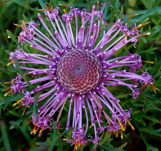
Purple Isopogon


Lepto Rotundifolia – Blue Lepto


Purple Kunzea


Banksia Praemorsa


Waxflower Purple Pride


Or, maybe some color enhanced Ultra Violet Banksia.

Thursday, December 29, 2016

Greenery: Encourages New Beginnings


The Pantone Color Institute has announced its Color of the Year for 2017 — and we’re back to just one color this year! It’s called “Greenery” or Pantone 15-0343 – a gorgeous shade of green.

The color is said to be symbolic of “new beginnings” — the reconnection we seek with nature and one another. Greenery is described by the institute as a “fresh and zesty yellow-green shade that evokes the first days of spring when nature’s greens revive, restore and renew.”

This annual color award is supposed to serve as an icon of what’s taking place in the world, an expression of the mood and attitude. And this year that mood and attitude is a yearning for a fresh New Year, healthier food choices, flowers, greens, and the outdoors — in one word, environment.

“There’s a growing desire to reconnect with Nature and what is real, and find ways to disconnect from technology. We need a break. We need to stop and breathe,” states Laurie Pressman, the Pantone Color Institute’s vice president.


So, in 2017 we’re planning to surround ourselves in “Greenery” and here’s some of our favorites!


Berzelia Lanuginosa


Green Boronia


Leucadendron Inca Gold


Leucadendron Nobel


Banksia Media


Banksia Speciosa


Green Kangaroo Paw


Protea Green Apple

Sunday, December 21, 2014

2015 Color of the Year: Marsala - An Earthy Wine Red

A naturally robust and earthy wine red, Marsala enriches our minds, bodies and souls.  Marsala is a subtly seductive shade, one that draws us in to its embracing warmth.   - Leatrice Eiseman Executive Director, Pantone Color Institute


Why did Pantone choose Marsala? Eiseman stated, "We felt it was time for something that spoke to people's real needs—the need of nurturing, the need for something more robust that had a life force that was intrinsic to it.  The most interesting thing about Marsala, I think, is that even though it has this grounded influence, this earthy undertone we see in the wine-red, at the same time, it has this sophistication.  There is something very versatile about the color." 


So, naturally when I heard the news I began to ponder about how the flowers and foliage we grow compliment this awesome color of the year.  Here's some Marsala inspiration to get you started. 

First, a few fabulous flowers and foliage that emulate this seductive shade.


Then, a look at how very versatile Marsala is when combined with other earthy hues.